

How to quickly utilize template and slot tags within your custom elements


Photo by Kalen Emsley on Unsplash
Web Components are a lot of fun and something I wish I got to work with more often, an opportunity came up at work recently and I jumped onto that so quick! 😅 I wrote an article previously that went over the basics of Web Components but didn't touch much on how you can leverage <template> and <slot> tags to help scaffold repeatable content. In this article, we will create a reusable card template and use slots to dynamically assign our content. Before we get started let's look at what the <template> and <slot> tags do.
Template and slot tags
The <template> tag holds HTML to be rendered on the page using JavaScript and is not visible to users as it is not actually rendered when the page is loaded. Template tags are useful for storing HTML that will be repeated or need to be rendered at a later time. It is worth noting that the template element has a content property that stores a read-only Document Fragment that contains the children of the tag. More information on templates can be found on MDN.
<template>
  <div class="card">...</div>
</template>
While <template> tags allow you to define reusable structures, the <slot> tag allows you to create placeholders for content that can be replaced. For example, if you have a list of cards the structure is going to be the same for each card, but the actual text content will vary from card to card. The <slot> tag allows you to override the text content by using an attribute slot with a value that corresponds with the name attribute defined in the <slot> element. More on MDN.
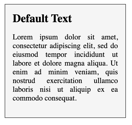
<template id="card-root">
  <div class="card">
    <h2>
      <slot name="card-title">Default Text</slot>
    </h2>
  </div>
</template>
Creating our template
<template id="card-root">
  <style>
    .card {
      max-width: 14rem;
      padding: 1rem;
      margin: 1rem;
      background-color: whitesmoke;
      border: 1px solid #303030;
    }

    .card h2 {
      margin: 0;
    }

    .card p {
      text-align: justify;
    }
  </style>
  <div class="card">
    <h2>
      <slot name="card-title">Default Text</slot>
    </h2>
    <p>
      <slot name="card-body">
        Lorem ipsum dolor sit amet, consectetur adipiscing elit, sed do eiusmod
        tempor incididunt ut labore et dolore magna aliqua. Ut enim ad minim
        veniam, quis nostrud exercitation ullamco laboris nisi ut aliquip ex ea
        commodo consequat.
      </slot>
    </p>
  </div>
</template>
We have defined a card template that contains two slots, one for the title and the body. The text that we place between the <slot> tags will serve as our default text if the slot is not overridden when we render our component. If we were to remove the template, our content would look like this.
Defining a custom element
In order to get our content to render we need to define a custom element, for this we are going to use the namespace wc-card where the wc stands for Web Component. The name assigned to a custom element must be in kebab-case and cannot be a single word. We start by using the customElements method to define our element by giving it a name and passing it a class that extends HTMLElement
class Card extends HTMLElement {
    ...
}

customElements.define("wc-card", Card);
In our class, we need to initiate the shadow dom and clone our template's content like so:
class Card extends HTMLElement {
  constructor() {
    // Don't forget to call super!
    super();

    const template = document.getElementById("card-root").content;

    this.attachShadow({ mode: "open" }).appendChild(template.cloneNode(true));
  }
}
Our web component has been initiated and the shadow DOM is populated with the cloned content from our <template> tag. Again, if you are not familiar with the shadow DOM check out the article I wrote on Web Components. We can now create as many clones of this template as we want!

Rendering our web component
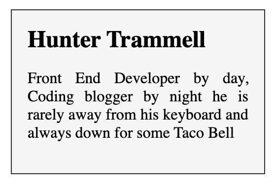
At this point, we have done everything we need to render our cards on the page, by defining a custom element all we need to do is place the <wc-card> tag somewhere on the page and our web component handler will do the rest! But we also set up a few <slot> tags so we can specify the text content to be used for each card. To get this working we need to provide some child elements to our custom element that have a slot attribute that matches the name we provided in our template.
<wc-card>
  <span slot="card-title">Hunter Trammell</span>
  <span slot="card-body">
    Front End Developer by day, Coding blogger by night he is rarely away from
    his keyboard and always down for some Taco Bell
  </span>
</wc-card>
This should render like so:
You can now repeat the <wc-card> element and provide new data, maybe even dynamically generate it with JavaScript and insert the text content dynamically from an array.

That is a basic overview of how you can utilize the <template> and <slot> tags in your custom elements. I hope you enjoyed this article and learned something new!
Happy Coding!